What Are the Positive and Negative Numbers Under the Totals in the Analytics Summary?
Summary
You may have noticed figures that are either positive (+) or negative (-) under metrics in the Siteimprove Analytics tool. The figures shown are comparisons of metrics (trend data). By default, Siteimprove compares the current period chosen with the previous period. This can be changed as needed.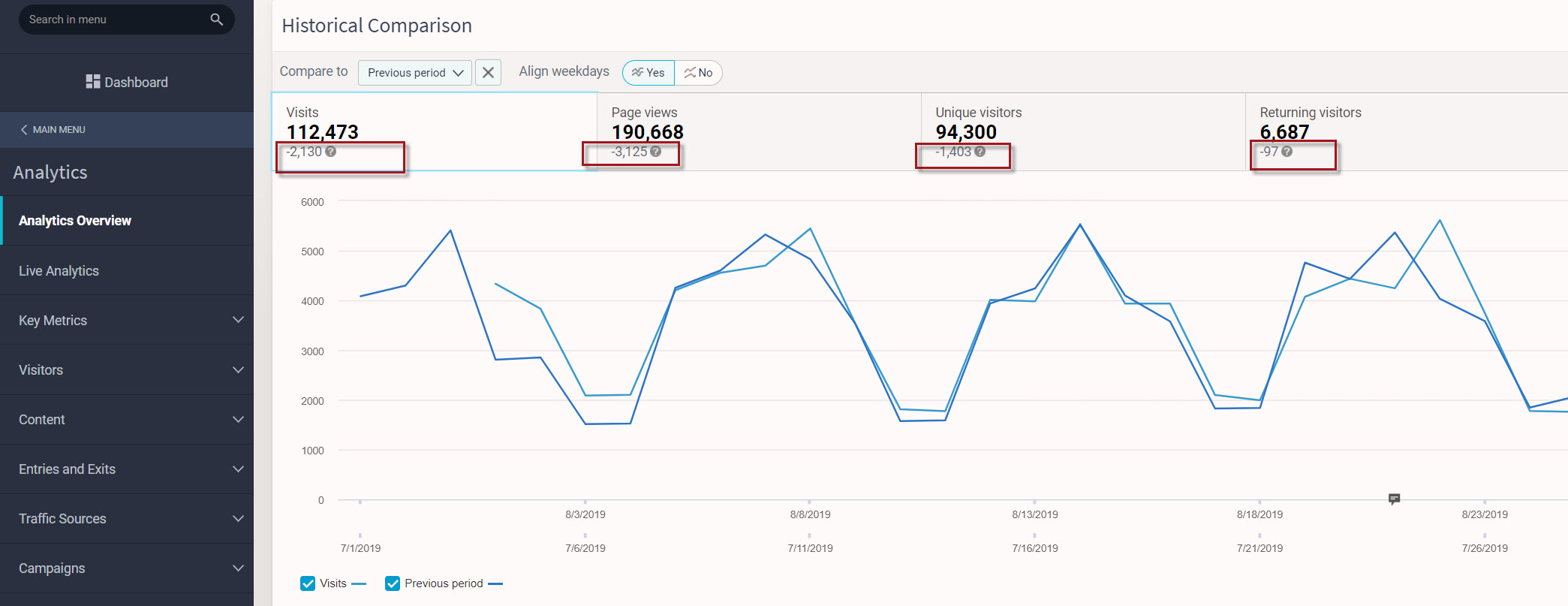
Answer
- You may have noticed figures that are either positive (+) or negative (-) under metrics in the Siteimprove Analytics tool.
- The figures shown are comparisons of metrics (trend data).
- By default, Siteimprove compares the current period chosen with the previous period.
- This can be changed as needed.
Where This Appears
- In the screenshot above, you can see where this trend data is displayed in the Analytics Overview Summary.
When Trend Data Appears
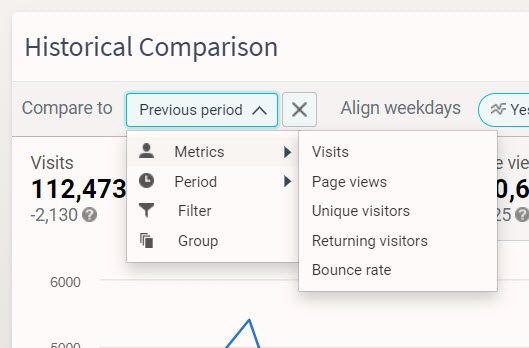
- Trend data will only appear when comparing with different periods, filters, or groups using the "compare to" dropdown.
Additional Context
- Metrics (e.g. visits, page views, bounce rate, etc.) are shown in graphs in the Overview Summary but do not provide trend data.
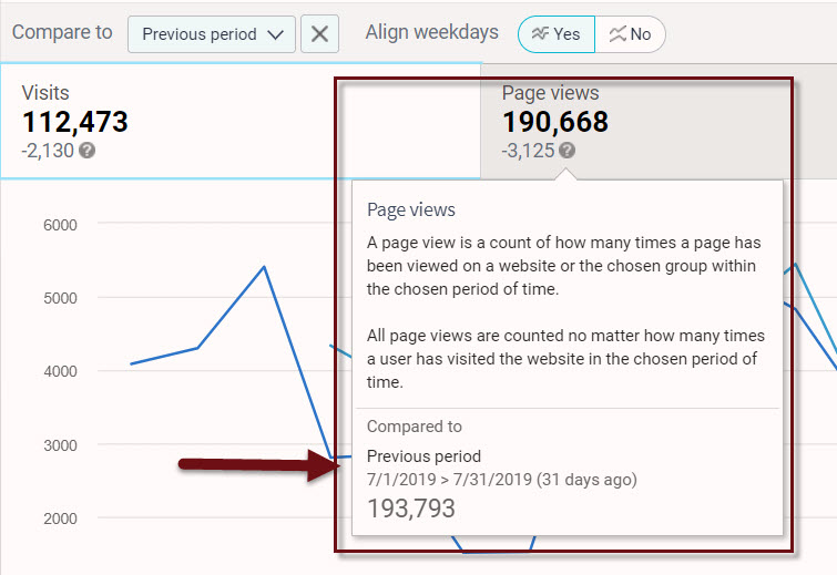
- By clicking on the question mark next to the figures shown, you will be given more detailed information.
- In this example, Q3 has been selected to show both results and results compared to Q3 in the previous year.
- We can now see that visits have decreased by 981 visits, indicated by the (-) sign.
Key Takeaways
- The figures shown are comparisons of metrics (trend data).
- Siteimprove compares the current period chosen with the previous period by default.
- Trend data depends on using the "compare to" functionality.
Did you find it helpful? Yes No
Send feedbackSorry we couldn't be helpful. Help us improve this article with your feedback.