What is a Click Map and how does it show visitors' interactions?
Summary
A Click Map in Siteimprove Analytics is a visual overlay that shows how visitors interact with elements on a webpage by displaying clickable areas and the number of interactions they receive.
Overview
The Click Map is a Siteimprove Analytics Behavior map feature found at Analytics > Behavior > Behavior maps. See also What is a Behavior Map and how do I add one? With the Click Map, you get an overview of every interactive element on the page you are inspecting. An interactive element is everything you can interact with on a page, including links, text, forms etc.
How Click Maps Work
The Siteimprove Click Map is a quantification of the Heatmap; a visual overlay marking each interactive element with a colored circle. The color of the circle indicates the number of interactions, using the same color gradient as in the Heatmap and Scroll Map, ranging from dark to bright colors.
- By hovering one of the circles (elements) on the page, you can see how many times the element has been clicked during the selected time period and the visits to the element on the page.
- By clicking on an interactive element, you will be able to see a more detailed view of the element.
- You can click up to five elements to compare them in the interactive points table.
- The interaction points table will be shown at the top of the Click Map.
What Click Maps Show You
- The Click Map can show you the difference between individual links with the same destination.
- Let’s say a page contains two links that lead to the same destination – one at the top of the page and one at the bottom. The Click Map can show metrics to see which link performs better.
Device-Based Interaction Insights
If you swap between desktop, tablet, and mobile views on a click map then the click data that you can see when you click on a circle on the screenshot will be filtered by the traffic type. So if you switch to mobile you'll see how many people clicked on an element from mobile, desktop will show desktop clicks, and tablet will show tablet clicks.
Example
We have selected a single month as the time period, and now we want to see metrics (visits and clicks) for the "Shop" element on Quant’s website for that period. We do this by hovering or clicking the circle on the "Shop" element.
- Visits: In the selected time period, 10 (or 4.05% of the total visits on this page) visitors clicked the "Shop" element on this specific page.
- Clicks: Out of those 10 visitors in the selected time period, visitors clicked 12 times (or 1.81% of all clicks on the page) on the "Shop" element on the specific page.
The data tells us that some visitors clicked more than once on the "Shop" element in one session. (Read more on what defines a visit and other metrics in Analytics.)
Key Takeaway
The Click Map is useful in helping you step back to evaluate both the amount and the kind of clickable options you are offering to your visitors.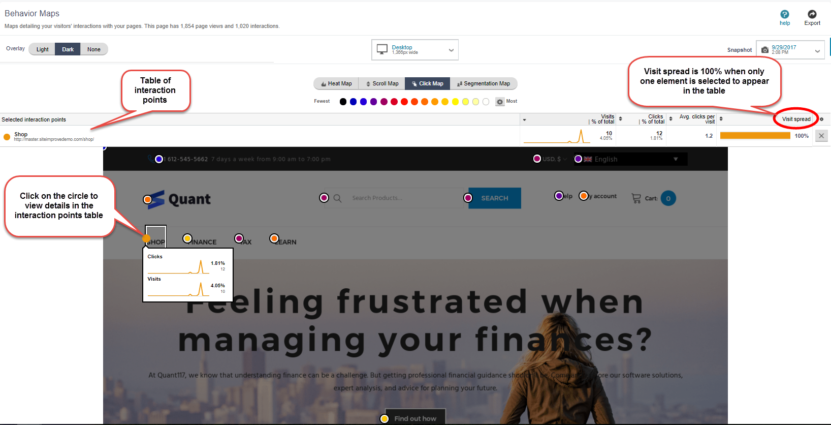
Additional resources
Did you find it helpful? Yes No
Send feedback